When we pick up a book, our first interaction is never with the words. It is with the weight of the paper, the texture of the cover, and the way the layout allows our eyes to travel across the page. In the context of designing an activity book, these elements are not merely aesthetic choices. They are the architecture of an experience. Design, at its most profound level, is the silent language through which a book communicates its intentions to the reader.
For a book inspired by a figure as visually powerful as Marilyn Monroe, the stakes of design are incredibly high. It is not enough for the pages to be “pretty.” They must serve a specific emotional purpose. A well-designed book acts as a container for the reader’s thoughts, fears, and dreams. If the design is too loud, it drowns out the reader’s inner voice. If it is too sparse, it feels cold and uninviting. The visual journey begins long before the pen touches the paper.
The challenge in designing an activity book for a modern woman is to find that perfect equilibrium—a visual sanctuary that feels both curated and open-ended. Every line, every margin, and every choice of typeface is an emotional signal. It tells the reader: “You are safe here. You have space here. Your reflections matter.”
What Makes an Activity Book Feel Safe and Inviting
Safety is a word we often associate with physical spaces, but it is equally vital in the psychological space of a creative journal. When a woman opens a book to engage in self-reflection, she is making herself vulnerable. Therefore, the visual environment must respond with gentleness.
In the journey of designing an activity book, creating a “safe” aesthetic means avoiding graphic aggression. This involves moving away from high-contrast, jarring layouts and instead embracing tonal harmony and visual softness. We focused on a perspective that honors the reader’s need for quietude.
Space is the most generous gift a designer can offer. In many traditional journals, every inch is filled with prompts, decorations, or instructions. This can feel claustrophobic, as if the book is shouting at the user. By contrast, a safe design prioritizes “white space”—the breathing room that allows the mind to expand.
This visual silence is essential for emotional legibility. When the pages feel airy, the reader’s anxiety decreases. There is no pressure to “perform” or to fill the space perfectly. The softness of the colors—creams, dusty roses, and muted golds—works on a subconscious level to lower the pulse. It creates an atmosphere of calm that invites the reader to linger rather than rush.
Choosing a Marilyn-Inspired Aesthetic Without Imitation
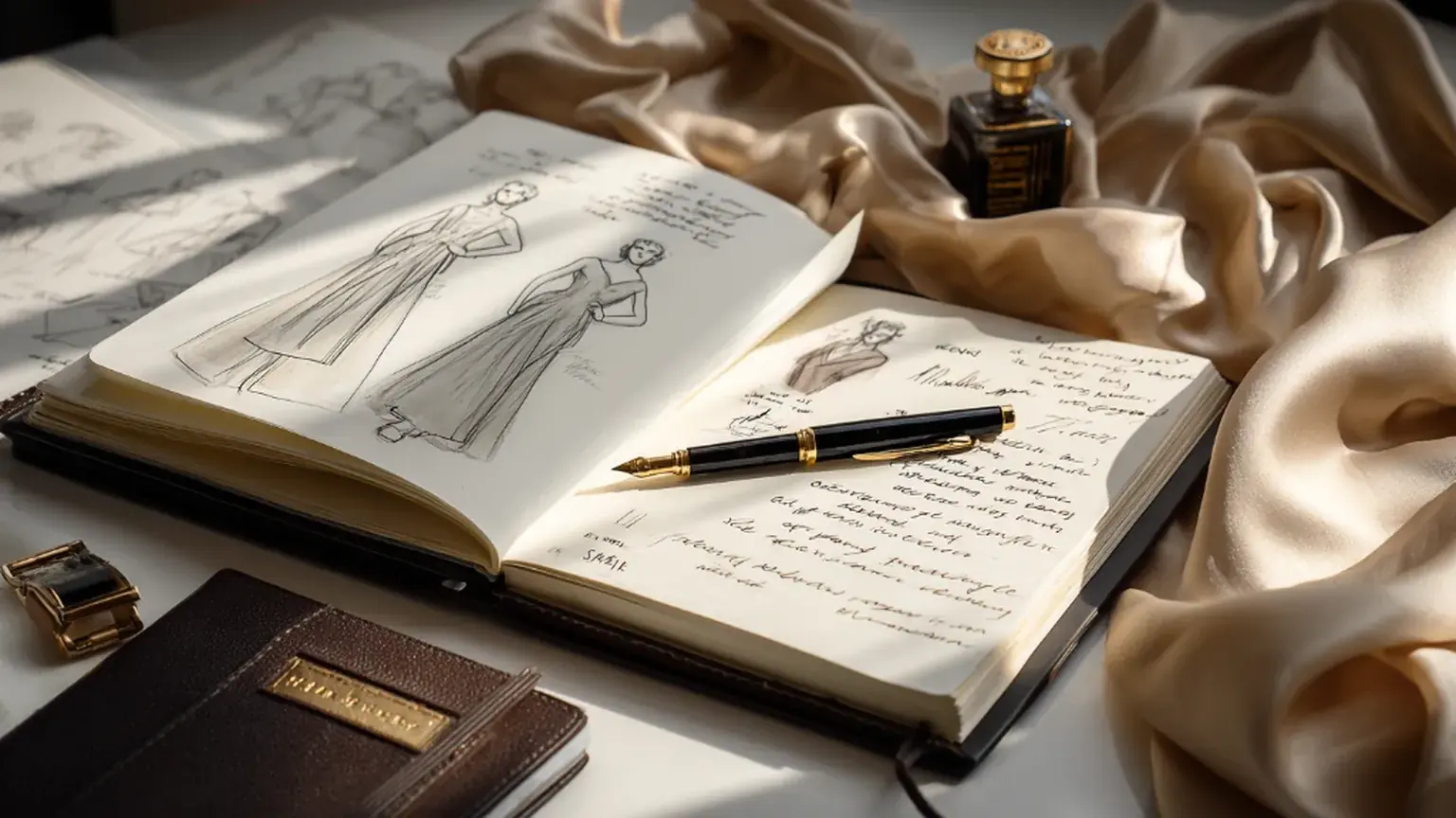
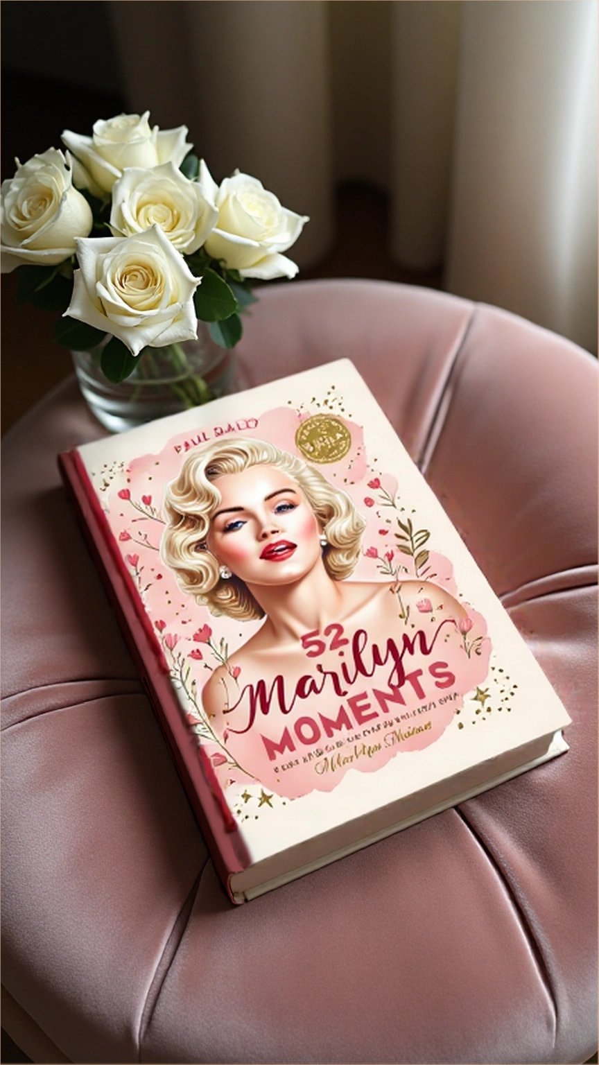
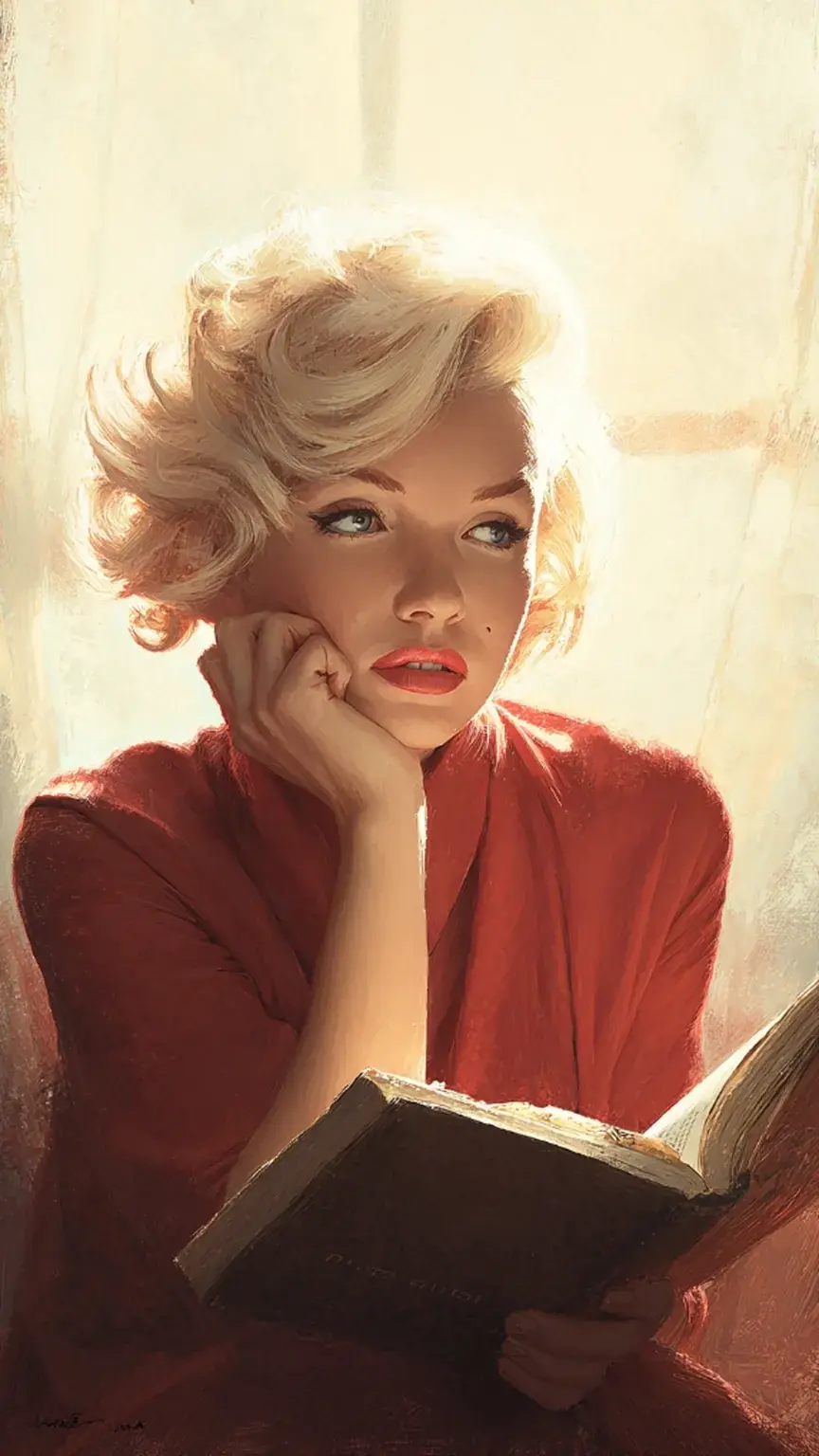
The most common trap when working with the image of Marilyn Monroe is the descent into pastiche. We have all seen the pop-art repetitions and the literal interpretations of the white dress or the red lips. When designing an activity book that honors her legacy, I chose a different path: the path of subtle resonance.
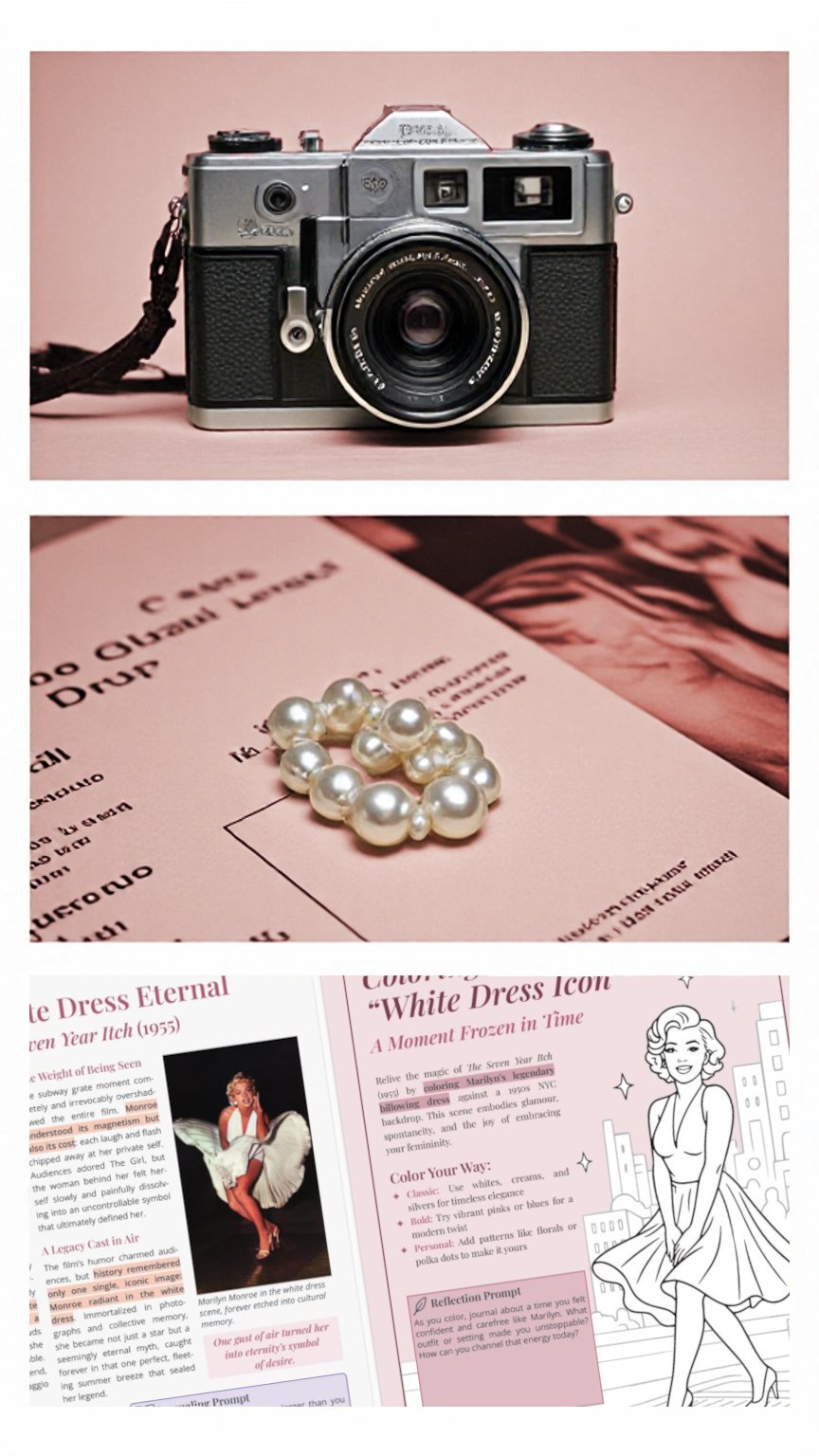
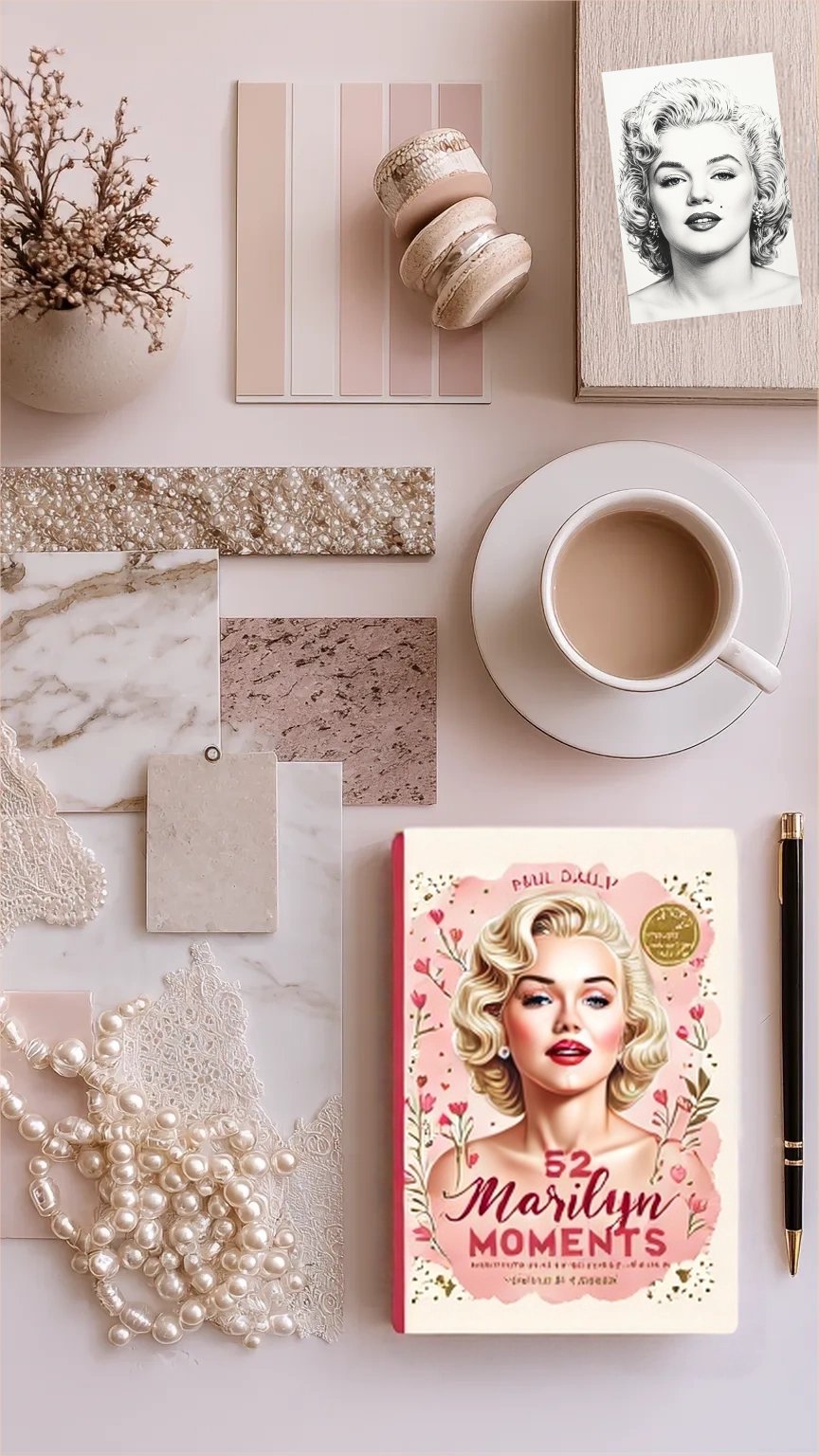
Instead of imitating her, the book aims to evoke the feeling of her era and her essence through abstract visual cues. Our mood boards were filled not with movie posters, but with the textures of her life. This inspiration is found in the textures and colors of the 1950s: the weight of vintage stationery, the grain of a 35mm photograph, and the specific luminescence of a Hollywood dressing room.
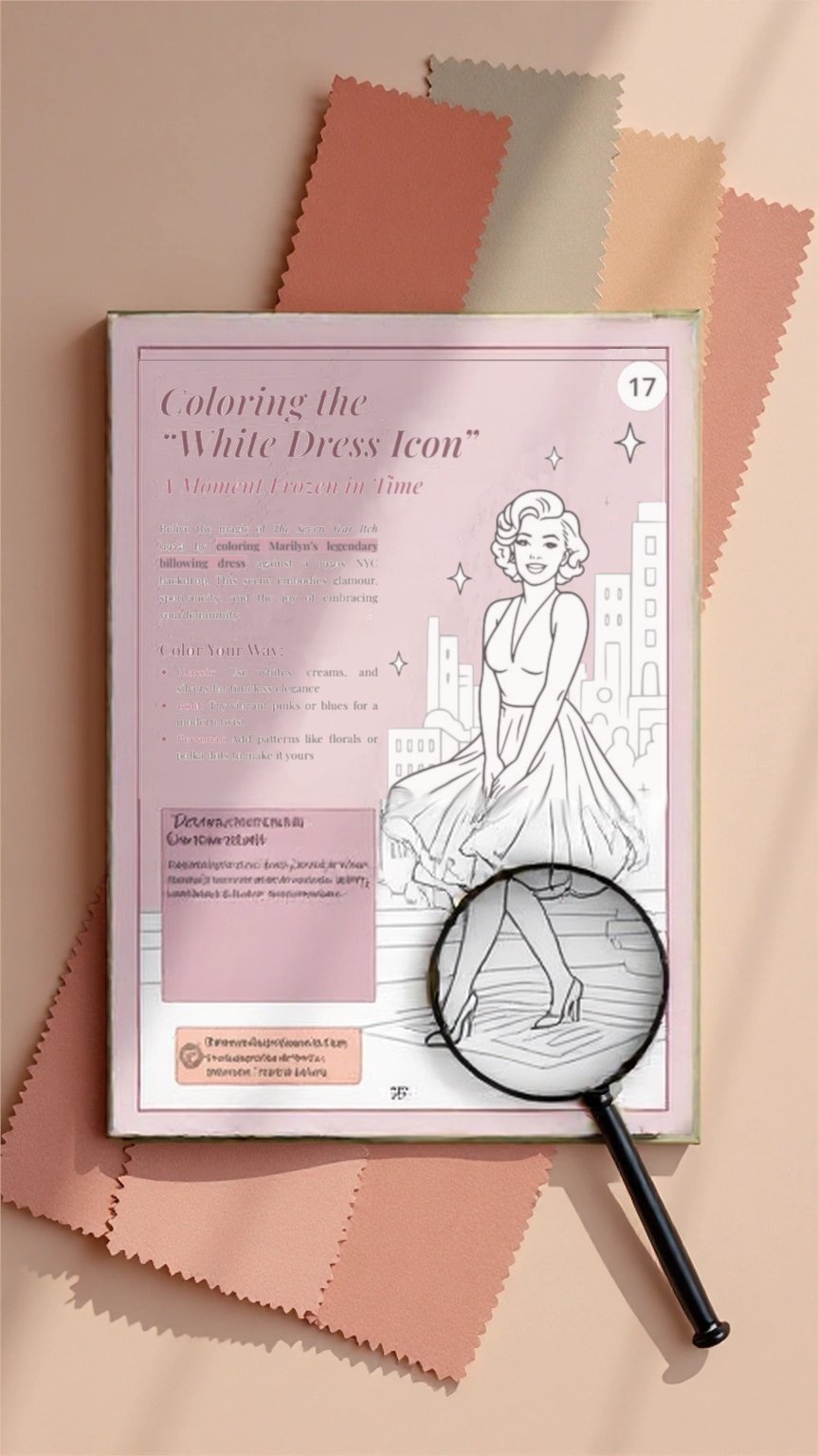
We look at the materials of her world—the silk of a robe, the matte finish of a script, the ink of a handwritten poem. By selecting swatches that mirror these memories, we create a bridge to her spirit without being literal. For example, instead of a photo of Marilyn, we might use a color palette derived from her favorite champagne or the specific blue of the California sky in 1954.
This approach respects the intelligence of the modern woman, offering her an aesthetic that feels sophisticated and timeless rather than “themed.” It allows the reader to step into a world that feels inspired by Marilyn’s grace, but leaves enough room for the reader to remain the protagonist of her own story.
Designing Pages That Encourage Expression
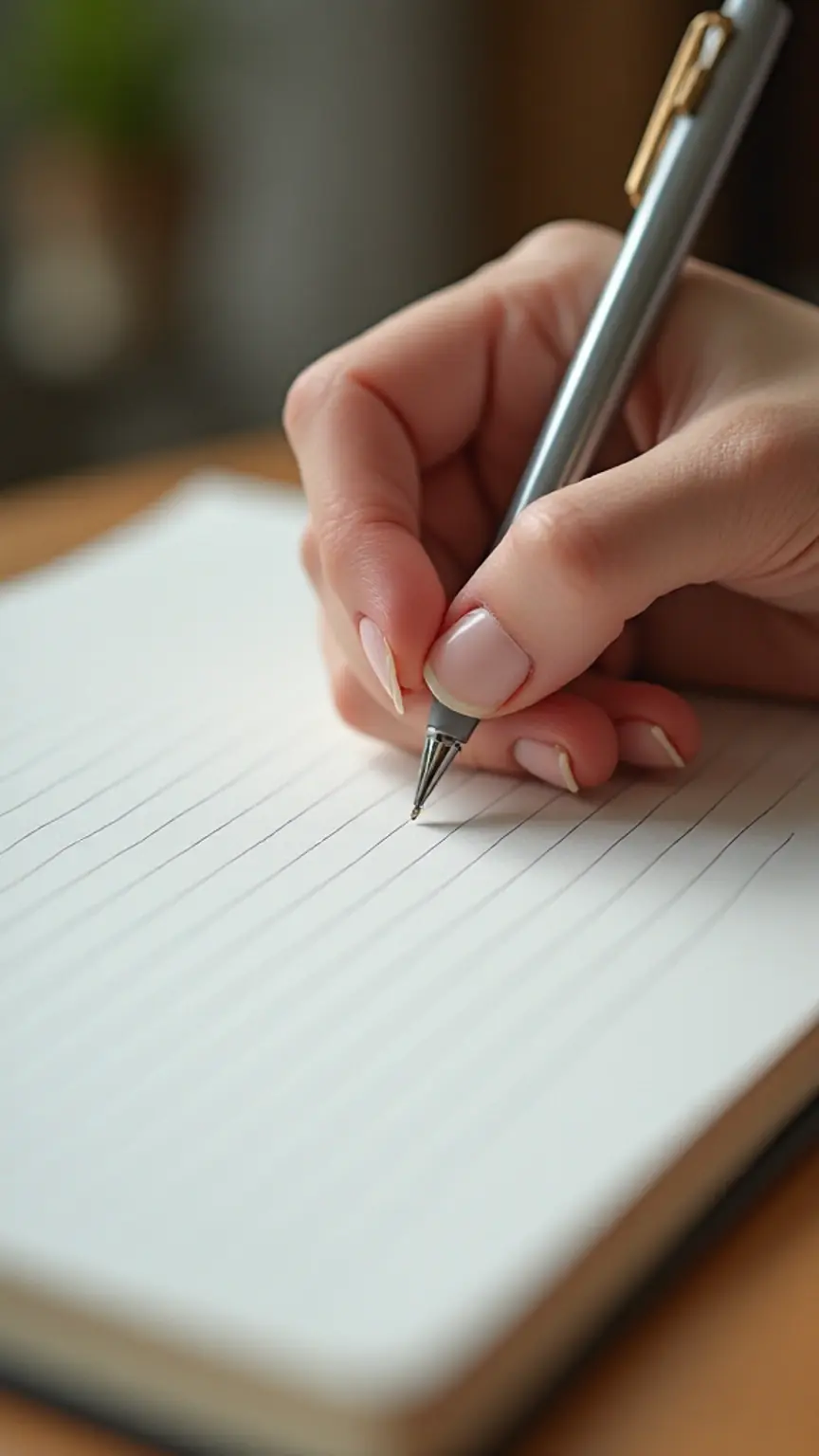
How does a woman interact with a page? This is the fundamental question that guides the process of designing an activity book. It is an ergonomic study as much as an artistic one. A page that encourages expression must be functional.
In this book, the pages are designed to be “interruption-free.” We have included wide margins that act as a buffer between the printed world and the reader’s world. As you turn the pages, you’ll notice a rhythm that feels entirely natural.
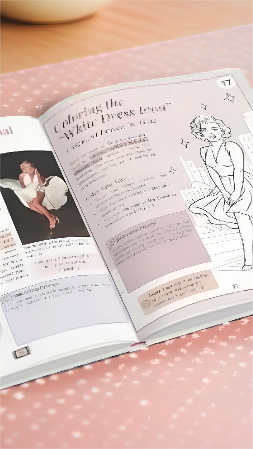
The visual rhythm is intentional; some pages are dense with evocative imagery to spark inspiration, while others are almost entirely blank to allow for an outpouring of thought. We understand that creativity is not a linear process. Some days, a woman might only want to write a single word; other days, she might want to fill three pages with sketches. The design must accommodate both. By balancing structure with openness, we create a rhythm that feels natural. It mimics the ebb and flow of a conversation between friends—sometimes listening, sometimes speaking, but always present.
Balancing Structure and Freedom
A book with no structure can be overwhelming. The “blank page syndrome” is a real barrier to creativity. Conversely, a book with too much structure becomes a chore. The secret to designing an activity book that people actually use lies in the delicate balance between the “frame” and the “freedom.”
The structure serves as a reassuring boundary. From the classic weight of the typography to the subtle guiding lines, the design says, “Start here.” It provides a safety net for those days when the creative well feels dry. However, the design also signals that these rules are meant to be played with. You might see a frame that looks like a vintage mirror—you could use it to write a self-affirmation, or you could sketch a dream you had. This flexibility acknowledges that every woman’s journey is unique.
Why This Book Looks the Way It Feels
There is a profound connection between the tactile and the emotional. When we talk about designing an activity book, we are talking about a physical object that will live in a woman’s most intimate spaces—her bedside table, her bag, her lap.
The “look” of the book must match the “feel” of the experience; it should feel like a companion waiting for you at the end of the day. If the book feels cheap or flimsy, the reader’s thoughts might feel less valuable. If the book feels precious and heavy, it honors the weight of the introspection occurring within.
This is why we focus on the “respiration” of the design. A page should feel like it has enough oxygen. The choice of typography—serif fonts that feel classic and grounded, paired with delicate scripts that feel personal—creates a dialogue between history and the present moment. The paper choice is essential; it must be kind to the touch and welcoming to the pen. When the visual and the tactile are in harmony, the book ceases to be a product and becomes a companion. It reflects the care that went into its creation, which in turn gives the reader permission to care for herself. The design is a mirror: it reflects the beauty and the complexity of the woman holding it.
Closing — Design as Care
Ultimately, the work of designing an activity book is an act of care. It is a labor of love that respects the user’s time, mental space, and emotional energy. Every design decision was made with a specific woman in mind—the one who is tired of the noise, the one who craves a moment of beauty.
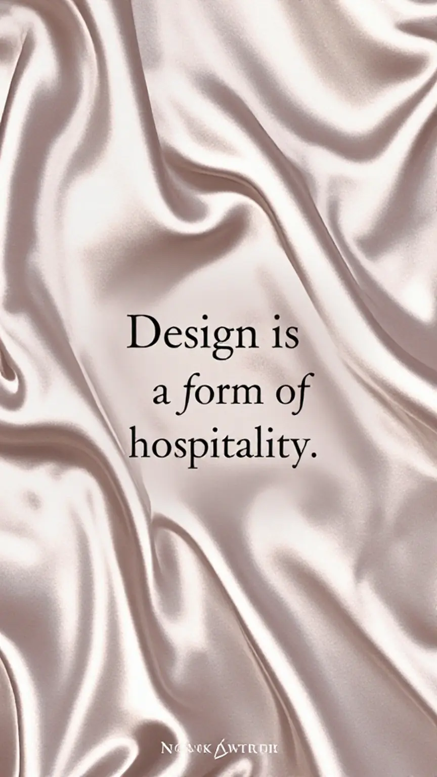
We do not view design as decoration; we view it as a form of hospitality. We are welcoming you into a space that has been prepared specifically for you. By choosing a Marilyn-inspired aesthetic that values softness over speed and reflection over performance, we are offering more than just a book. We are offering a sanctuary. In this space, you are not just a consumer; you are an artist of your own life. And every page you turn is a testament to the fact that your inner world deserves a beautiful place to rest.
Reflection Prompt: What kind of design helps you feel free rather than pressured? Is it the silence of a blank page, or the gentle guidance of a beautiful frame?